The Frontend Is Not the Source of Truth in E-commerce
A polished product page can show the wrong availability or confirm an unaccepted cart change. The solution starts with clear ownership of data, states and acceptance.
On this page
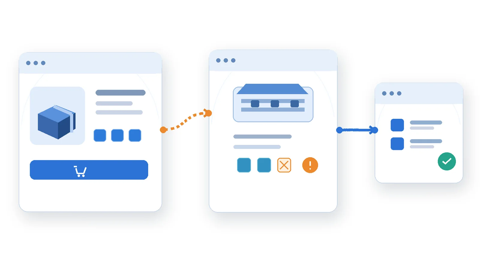
A shopper opens a product page and sees that an item is available for pickup. They choose a different branch, select three units, and add them to the cart. The interface shows a green confirmation. At checkout, the quantity is reduced—or the pickup choice is rejected. To the shopper, the website contradicted itself.
There are several plausible causes. The product page may have displayed older availability data. A request for the previous branch may have completed after the request for the new one. The cart may have been updated optimistically and mistaken for an accepted business transaction. Or checkout may apply a rule that earlier stages never knew about.
This is a hypothetical journey, not a documented Technway or client incident. My work on established e-commerce frontends provides the professional context for the question, while the scenario and proposed design are illustrative. The problem is not that a button or component looks incorrect. It is that the interface presents local state as if it were an authoritative business decision.
Decide who owns a fact before deciding where to display it
Frontend state is not inherently unreliable. It is the right place to own which tab is open, what text the visitor is currently typing, or which temporary filter is selected. Problems begin when transient interface choices are confused with facts controlled elsewhere: current inventory, valid pickup locations, final prices, promotion eligibility or whether an order has been accepted.
Different systems can legitimately own different answers. A catalogue service may provide product descriptions and an indicative stock status. A store-availability service may provide location-specific pickup options. A cart service may validate line items. Checkout may reserve stock or run further rules. The architecture determines the true authority; it cannot be inferred from the screen on which information first appears.
The model I would write before implementing the UI has three columns: what the visitor is choosing, which service or policy validates it, and when the UI is allowed to present the choice as confirmed. These are product decisions as well as engineering decisions. A label like “Available now” is stronger than “Availability will be confirmed at checkout,” and the wording should match the actual contract.
A response is a snapshot, not a promise about the future
A product page may request stock at 10:00 and receive a plausible number. Another order can change availability before the visitor reaches checkout. Even a fresh response cannot guarantee that an item will remain in stock until a reservation or purchase completes. The frontend should not promise stronger certainty than the backend provides.
That does not require displaying anxious warnings beside every product. It requires using honest state transitions. “In stock at this branch” can be useful information if the system defines its freshness and scope. “Reserved for you” should appear only when a real reservation has been accepted. “Order confirmed” should follow the authoritative order outcome, not merely a successful click handler.
A well-designed UI also handles the spaces between those states. The shopper can express intent immediately, while the interface shows validation in progress and prevents contradictory confirmations. The application should retain enough context to explain a change when the server rejects or adjusts the request.
Changing location makes request ordering part of correctness
Suppose the shopper chooses Branch A, then quickly switches to Branch B. The UI sends an availability request for A and another for B. If the B response arrives first and A arrives later, an implementation that applies whichever response completed last can display availability for A while the selected control says B.
This is not hypothetical JavaScript behavior: asynchronous responses can complete out of order. React’s official useEffect guidance includes an example of ignoring an earlier result during cleanup to avoid race conditions. Frameworks and data libraries can provide stronger request-keying, cancellation, cache invalidation or deduplication, but the design still needs a rule: only an answer for the active selection can update the active selection’s availability.
A request identifier, selection key or query cache key can enforce that rule. A late response for Branch A may be useful in a correctly scoped cache, but it must not overwrite the visible state for Branch B. When the visitor changes branch, the old availability should be cleared or clearly marked stale until the new branch has been checked. Keeping the old green status with a new branch label is misleading.
A test that runs only on a fast local connection may never exercise this race. Deliberately hold the first response, return the second, and then release the first. Verify that the visible branch, stock state and button behavior still correspond to Branch B. Repeat the sequence when the new request fails, because rejection can be as important as a successful out-of-order response.
Optimistic interaction is useful; optimistic authority is dangerous
Optimistic UI can make a cart feel responsive. Adding an item may immediately update a quantity badge while a request is in flight. That can be reasonable when the UI has a rollback strategy, avoids irreversible side effects, and distinguishes a provisional change from a confirmed line item.
The risk is treating the local update as proof of acceptance. A badge increasing to three does not guarantee that three units were added to the server-side cart. If the backend rejects the quantity or adjusts fulfillment, the frontend should reconcile the cart from the accepted response and explain the result. It must not leave a success message on screen and an inconsistent cart below it.
API status handling matters here. MDN documents that fetch resolves for HTTP error responses such as 404 or 504; application code must check response.ok or the status. A 409 Conflict can indicate a clash with the current resource state, although the API contract—not the HTTP number alone—defines how a particular cart handles stock or concurrent changes. A generic catch block that only handles network rejections will not reliably handle business rejections returned as HTTP responses.
An interface can use optimistic state when the operation is low risk and reversible, and use a stronger confirmation boundary before implying that money, reservation or entitlement changed hands. There is no universal rule that every cart action must block until the server answers. The product needs to identify what users can safely assume at each stage.
Turn unavailable states into useful alternatives
When a server rejects the selected pickup option, an error message that says only “Something went wrong” leaves the shopper without a path forward. A better message names the part of the decision that could not be honored: the selected branch has insufficient stock, the requested quantity changed, or pickup is not supported for this item. It should offer legitimate next steps when the system knows them.
For example, the application could show the accepted quantity, invite the shopper to choose another branch, or allow delivery if that option is truly available. It must not invent alternative locations or show a delivery promise derived from stale data. Any suggested recovery should be validated under the same rules as the original choice.
Accessibility is part of that recovery contract. The related discussion of accessible components and inaccessible journeys examines that same boundary between correct controls and reliable user outcomes. If the price or fulfillment choice changes after an asynchronous request, users need to perceive the result and continue from a sensible focus position. WCAG 2.2 includes criteria for keyboard operation, error identification and programmatically determinable status messages. Those criteria do not dictate a single React implementation; they require the resulting journey to remain understandable and operable.
Test transitions, not just the successful final screen
A screenshot of “available” and a screenshot of “out of stock” prove little about how the application moves between them. Important failures happen in transitions: a user changes location, a request is delayed, a cart mutation is rejected, an old response arrives, or checkout updates a previously accepted quantity. Test those sequences explicitly.
| User-facing state | Where the answer comes from | What the UI may claim |
|---|---|---|
| Branch selected | Local choice; stock API validates | Pending until response |
| Stock label | Availability snapshot | Not a reservation |
| Cart count | Accepted cart response | Provisional or confirmed |
| Order success | Order/checkout service | Only after acceptance |
I would organize verification around three boundaries. First, selection: the active product, branch and quantity must always match the request being displayed. Second, acceptance: a local click should become a confirmed cart or order state only on the response defined by the business contract. Third, recovery: rejected or adjusted results must update the visible record, avoid duplicate submissions and give the visitor a comprehensible next action.
Use representative fixtures for each outcome rather than making every browser test depend on live stock data. Contract tests can verify the shape and semantics of API responses, component tests can explore loading and stale states, and integrated journey checks can establish whether the browser presents the accepted result correctly. Reserve live end-to-end checks for the boundaries that mocks cannot prove, such as a real reservation or payment acknowledgement.
Questions that expose a false confirmation
Ask the team what “added” means on this particular screen. Did the user simply express intent? Did the cart service persist a validated line item? Did inventory become reserved? Could another stage still change the quantity or price? Each answer describes a different milestone. The UI should communicate the milestone it actually reached, not the most reassuring one.
Also ask which observable event can disprove success. If a request fails after a provisional UI update, does the customer see a correction? Can the same click be safely retried without doubling the item? Does a rapid location switch ever show the wrong store’s result? Can analytics distinguish a click from a server-accepted action? These questions are test cases, not abstract architectural preferences.
Accuracy is a relationship between systems
An e-commerce frontend is not merely a collection of components rendering API data. It translates user intent into requests governed by inventory, fulfillment, pricing and transaction rules, then turns those outcomes into an understandable customer journey. It can own presentation and temporary selections; it should not quietly invent authority over facts it cannot guarantee.
The strongest design is not always the slowest or most conservative one. Responsive interaction and authoritative validation can coexist when their boundaries are explicit. The key is that the customer should never have to infer which green checkmark is provisional, which value is current, or whether the business actually accepted the request.

The Release Risk Hidden Inside a Small Frontend Change
How to evaluate impact when a new interface must coexist with an older one
Read article
An Accessible Component Can Still Create an Inaccessible Journey
Accessible buttons and checkboxes are only the beginning. A practical look at focus, status announcements, stale responses, empty results, and the transitions that make dynamic interfaces usable.
Read article