An Accessible Component Can Still Create an Inaccessible Journey
Accessible buttons and checkboxes are only the beginning. A practical look at focus, status announcements, stale responses, empty results, and the transitions that make dynamic interfaces usable.
On this page
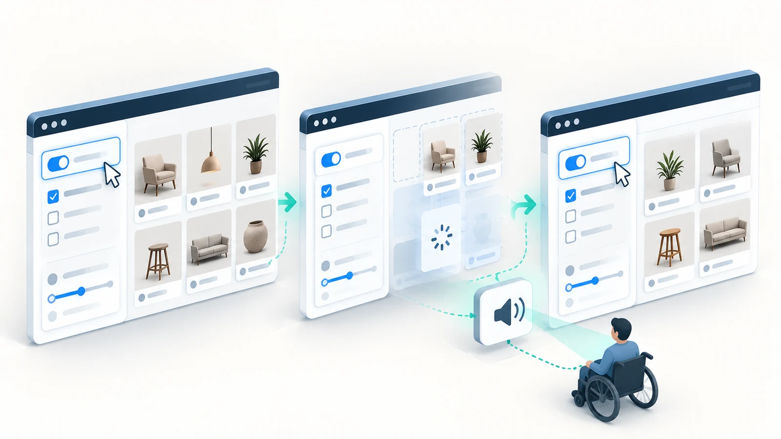
A filter control can be correctly labeled, reachable with the keyboard, and implemented with native HTML. Every individual button and checkbox on the page can appear to satisfy its own accessibility checks. Yet the person using those controls may still lose track of what happened after selecting a filter.
The results update silently. A loading indicator disappears without conveying whether the search succeeded. Keyboard focus lands somewhere unexpected when an item is removed. Two requests finish out of order, so the visible result count no longer matches the selected filters.
These problems are not necessarily defects in the filter control itself. They arise where component behavior meets asynchronous data, page structure, and the user’s task.
Working with established e-commerce frontends has made me interested in that boundary: the difference between building a usable control and preserving a usable journey as the interface changes. The product-filter example below is illustrative, not a client implementation, production incident, or record of testing I carried out.
Component accessibility is necessary, but its scope is limited
A labeled checkbox should expose its name and checked state. A button should be operable by keyboard. Focus should be visible. Those qualities are foundational and often easier to verify in isolation than across an entire page.
But a control’s contract ends too early if we stop asking questions when its event handler runs. Changing a filter may trigger data fetching, remove elements, alter a result count, reveal an empty state, or cause an error. The interface now owes the user answers about what changed and where they can go next.
The W3C’s guidance on name, role, and value explains requirements for the information exposed by individual controls. Its guidance on status messages and focus order addresses other consequences of interaction. Neither a single ARIA attribute nor a correct component API, on its own, demonstrates that the complete journey works.
That is the distinction I want a design and engineering review to preserve: local accessibility describes properties of a component; task accessibility depends on the relationships and transitions between those components.
Follow one filter through the states the user actually encounters
Imagine a product-listing page with a checkbox labeled “Available for delivery.” Selecting it updates the results without navigating to a new page. The visitor may then refine the selection, remove the filter, open a product, or try again after a connection failure.
The visible checkbox is only the first step. The journey has several meaningful states: the current results, a change requested, loading, an updated result set, no matching results, and a failed update. A second change may arrive while the first is still loading.
The useful design question is not just whether each of those states has a visual treatment. It is whether someone can understand the state, interact with it, and recover without relying on sight or a pointer.
| Transition | User needs to know | Failure that would mislead |
|---|---|---|
| Filter selected | The selection is active and an update has started | Checkbox changes but request never starts |
| Results loading | Whether previous results remain visible or new results are pending | Old results appear to be the final filtered set |
| New results accepted | The latest selection's result count, without forced focus | Update is silent or focus jumps away |
| No matches | The request succeeded but returned zero products | Empty grid is mistaken for a failed request |
| Request fails | The update failed and which results are currently shown | Old results are presented as newly verified |
| Filters changed quickly | Only the newest request determines the committed results | Late response overwrites current selection |
| Focused result is removed | A logical place to continue keyboard navigation | Focus disappears when its DOM node unmounts |
The rightmost column is especially useful in reviews. It describes the harm caused when a transition is missing or misleading. A user might press the correct control and receive the wrong conclusion about whether the action worked. Fixing the button’s semantics alone would not address that failure.
Announce the result without moving focus unnecessarily
Suppose the visitor selects the checkbox and six products remain. The page may visibly display “6 products found.” A screen-reader user who remains focused on the filter should be able to learn about that relevant result without having to explore the whole page again.
WCAG 2.2 success criterion 4.1.3 requires status messages in markup to be programmatically determinable so assistive technologies can present them without receiving focus. The W3C explicitly uses result counts such as “5 results returned” as examples of status messages. The results grid itself is not automatically a status message; a concise update about the result can be.
A persistent, correctly configured status region can communicate an update such as “6 products available for delivery.” It should contain enough context to make sense when announced outside the visual layout. It should also correspond to the results that were actually committed to the screen—not to an older request or an optimistic guess.
Announcing every intermediate keystroke, loading frame, and result item can be worse than providing no useful summary. MDN’s live-region guidance and W3C’s explanation both support carefully scoped announcements rather than constant interruption. The practical decision is which changes are meaningful: the start of a noticeable wait, a completed update, an empty result, or an error that needs attention.
There is also a subtle timing issue. An ARIA status region is not an announcement queue that automatically works in every browser and assistive-technology combination. It must be established and updated appropriately, and its behavior should be checked with representative assistive technology rather than assumed from the DOM alone.
Focus belongs to the task, not the latest DOM update
When filtering updates the result grid, moving keyboard focus to the first result may appear helpful: the products have changed, so why not take the user directly there? But doing that after every filter change can be disorienting. A shopper adjusting several filters may be forced to navigate back to the controls repeatedly.
For the illustrative page, retaining focus on the checkbox while announcing a meaningful result count is often the more predictable behavior. The shopper can then choose whether to continue filtering or move to the results.
There are situations where focus management does require an explicit decision. If a focused product card is removed after a refresh, the control that held focus no longer exists. The team must provide a sensible next location rather than allowing focus to disappear into an unpredictable place. If an interaction opens a modal dialog, its focus behavior is different from an ordinary in-place update.
W3C’s focus-order guidance requires an order that preserves meaning and operability, not an exact match to the screen’s pixel order. Its On Input guidance also distinguishes an in-place content change from an unexpected change of context. Dynamically updating a result list is not automatically the same as moving focus or navigating somewhere else.
That nuance matters. The answer is not “always move focus” or “never move focus.” It is to understand whether the user’s context changed and to choose focus behavior that preserves the next meaningful action.
Async correctness is part of the accessibility problem
Consider a user who turns on a delivery filter, then quickly changes the selected price range. Two network requests are now in progress. The later request finishes first and correctly displays five matching products. The earlier request finishes afterward and overwrites the grid with a different result set.
The checkbox and slider may both remain keyboard-accessible. The live region may correctly announce the latest DOM update. Yet the page is communicating the wrong result for the controls the person actually selected. This is a correctness problem that becomes an accessibility problem because it deprives the user of dependable feedback.
A robust implementation needs a policy for concurrent requests: cancel superseded requests when possible, track which request represents the current selection, and prevent obsolete responses from replacing newer state. The browser’s AbortController can cancel supported fetch operations, but cancellation alone should not be treated as a universal guarantee that no stale result will commit. State identity and response ordering still deserve explicit handling.
The corresponding feedback should follow the same source of truth. If a request was superseded, it should not announce a result count as if it belonged to the current filters. If the latest request fails, the interface should not silently describe the previously displayed products as newly filtered results.
Empty results and failed results are not the same state
An empty result set means the filter operation succeeded and found no matching products. A failed request means the system could not establish the result. Both can produce a blank grid, but they require different explanations and recovery paths.
For zero matches, a useful message might say that no products match the selected filters and offer a clear way to change them. For a network failure, the interface should explain that the results could not be updated and indicate whether the previous results are still being shown. If the user can retry, the retry should apply to the current selection.
The same principle applies to partial results, cached data, and delayed responses. The user should not have to infer whether the visible products are current or merely retained from before the change. Where freshness materially affects a purchase decision, that distinction is part of the product contract, not just an implementation detail.
Keeping the previous results visible during loading may be a good choice, but only if their status remains understandable. Replacing the entire page with a spinner is another possible choice, with different costs for navigation and context. Neither is inherently more accessible without considering the task and what the interface communicates.
Test the journey after each meaningful transition
Isolated component checks still provide value. They can confirm names, roles, states, and keyboard handling. They are not enough to establish that a dynamically updated page preserves an understandable experience.
For the hypothetical filter, I would build a small verification matrix around actions and their observed consequences. It would include the keyboard-only experience and representative screen-reader testing in addition to functional assertions.
| Journey test | Action and conditions | What must be observed |
|---|---|---|
| Keyboard filtering | Tab to checkbox; toggle; continue adjusting controls | Control operable, focus visible and predictable |
| Screen-reader feedback | Apply filter and wait for updated result count | Concise, contextual status announced without forced focus |
| Rapid changes | Apply two filters while first request is delayed | Latest filter controls both results and announced count |
| Zero results | Apply combination with no matching items | Clear zero-result message and recoverable filter choices |
| Network failure | Reject the latest request while old results remain visible | Failure communicated; old data not mislabeled as current |
| Focused content removed | Change results while focus is on a product action | Keyboard focus remains logical and usable |
| Responsive + assistive tech | Repeat key task at narrow width, zoom, and a screen reader | No lost controls, unexpected context changes or blocked next action |
Automated tests can check selected states, request-order behavior, DOM attributes, and some accessibility violations. They cannot reliably determine every question about how a screen reader announces a sequence or whether the interaction remains understandable to a person using it. W3C’s evaluation guidance makes that limitation clear; automated checks support manual evaluation rather than replacing it.
This does not mean every small change requires a comprehensive study. The effort should be proportional to the risk, the number of consumers, and the impact of the change. A shared filtering pattern that appears across many product categories deserves broader verification than a contained low-impact visual adjustment.
The distinction between component-level checks and an end-to-end task also informs Testing Shared UI Components Without Testing Every Page Twice.
Define the boundary before declaring the feature accessible
A reusable control should own its accessible name, state, and appropriate interaction pattern. The page or feature coordinating the controls should own which requests are current, what result is presented, how loading and errors are communicated, and where focus belongs when content changes.
Those responsibilities may be implemented through shared components, hooks, services, or page-level logic. The framework choice matters less than making the contract explicit. Otherwise the accessible checkbox is correct in isolation while the page around it silently invalidates the user’s understanding.
Before approving a change to a dynamic interface, I would want an answer to five connected questions: What changed? Which state is now authoritative? How does the user learn that? Where does focus remain? And what can they do next if the result is empty, delayed, or unsuccessful?
These are design, product, and engineering questions together. Answering them early is more effective than treating accessibility as a last-minute collection of attributes or a report produced by a scanner.
The task is the unit that ultimately matters
A component may be technically well implemented, semantically correct, and easy to reuse. Those qualities are real achievements. But the user experiences the product as a sequence of decisions and responses, not as a collection of individually tested controls.
The strongest accessibility review therefore keeps both levels in view. Verify the control. Then follow the task through the states it creates. When data, focus, and feedback stay aligned, the interface becomes more reliable for keyboard and assistive-technology users—and more understandable for everyone.
Testing Shared UI Components Without Testing Every Page Twice
Reusing a UI component does not mean testing every page identically. A practical coverage map shows which behaviors belong in component, integration and browser tests.
Read article
When Reusable Components Become the Wrong Abstraction
Two interfaces may look almost identical while behaving very differently. A practical look at when to share frontend components, when to split them, and how to keep the useful reuse.
Read article